

For twenty-seven years, a photographer in Los Angeles printed little clusters of symbols next to the men in his magazine. Arrows. Circles. A bowtie. A star. A tiny trident. If you had the key, you could read a model like a paragraph. If you didn't, you saw decoration.
I design marks for a living, so this one got its hooks in me fast. Here's what the code was, what the symbols actually say, and how the whole system ended up as evidence in a criminal case.
The short answer
Bob Mizer called it his subjective character analysis.
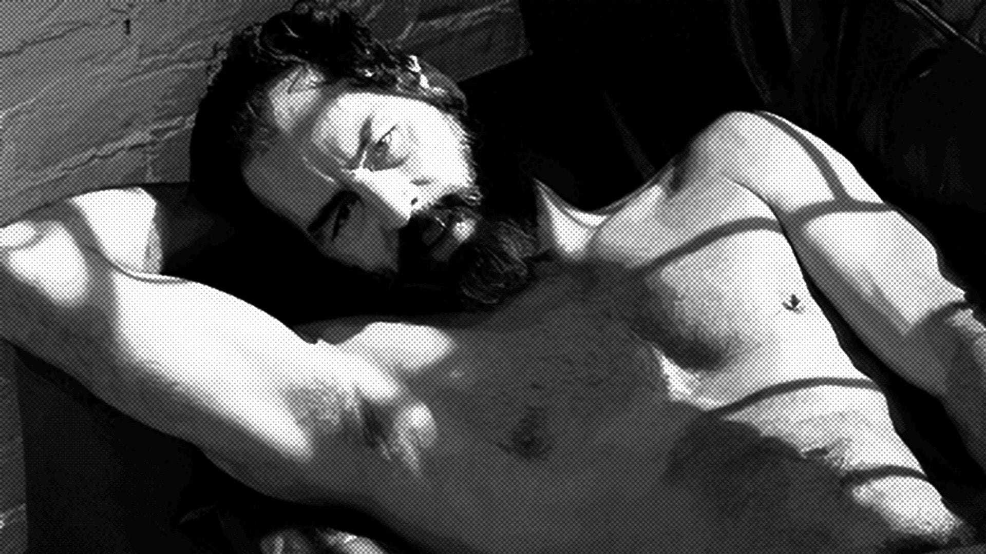
Mizer ran Physique Pictorial, the quarterly he published in Los Angeles from 1951 to 1990 through his studio, the Athletic Model Guild. Starting in 1963, he began printing small symbol clusters beside photos of his models, and he kept it up until the final issue.
The symbols rated the model's character. Not his measurements. His personality, his habits, his manners, and in several cases his criminal tendencies.
The Bob Mizer Foundation holds original copies of the code sheet. A collector's copy is also public: it sits in the Daniel D. Teoli Jr. Archival Collection on the Internet Archive, catalogued as a breakdown of the symbol chart Mizer used to grade models. That's where the rest of this post gets its vocabulary.
The symbols came from astrology, and you can see it
The Foundation says Mizer's symbols derive from astrology, a subject that fascinated him his entire life, and archivist Keith Foote finds the zodiac all through the daily diaries Mizer kept from his teenage years.
Look at the chart and it's right there on the page.
♂ is "typical man." That's Mars, the male symbol, sitting at the top of the chart like a baseline.
♄ is "devotion to duty and work." Saturn, which in astrology governs discipline and obligation. ♎, the Libra scales, is "well-balance of personality."
♍ is "introverted." ♏ is "extroverted." Virgo and Scorpio, pressed into service as personality tags.
△ is "intellectual, avoids the trivial and emphasizes lofty goals." ∞ is "tends to form lasting friendships." ★ is "very affable." □ is "conformist," which is the single most on-the-nose glyph in the entire system.
He didn't invent a private alphabet from nothing. He raided the one he'd been obsessed with since childhood and repurposed it to describe the men who walked into his studio.
What the code actually says about people
This is the part that surprised me. I expected a hookup vocabulary. What the published chart mostly contains is character judgment, and a lot of it is brutal.
The harmless end is almost sweet. There's a symbol for early riser and a different one for late riser. There's self controlled, well-balance of personality, very affable, aggressive enthusiastic, humourous, likes variety, prefers tongue-in-cheek type of humour.
Then it turns.
There's a symbol for pathological liar. One for deceitful. One for petty thief. One for criminally inclined. One for physically dangerous. One for vain, one for boastful and arrogant, one for obsequious, one for ingratious, one for glutton, insatiable appetites, one for hostility, tends to have "chips on shoulder."
There's a symbol for hypochondriac. There's a symbol for strongly religious. There's one for ergophobia, which the chart helpfully glosses as intense dislike to work, because apparently "lazy" needed a clinical upgrade.
And there's a symbol for difficult personality, tends to be "problem child."
Every one of those is from the chart itself.
Sit with it for a second. A young man comes to Los Angeles, takes his clothes off for a camera, and gets published. In the corner of his own photograph, in a language he probably can't read, the photographer has filed him as a petty thief. Thousands of subscribers could read that. He may never have known.
It has grammar
The detail that made me put my coffee down: the chart includes two modifier marks.
One means intensifies characteristic described. The other means detracts characteristic described. They're written as a plus and a minus against a double bar.
That's a language with adverbs. Slightly vain and extremely vain were two different statements, and Mizer had notation for both.
It lines up with what the Foundation's vice president found. John Renner worked out the structure of the clusters, modeling his approach on the linguists who deciphered Mayan hieroglyphics. He describes the basic unit as a base ring or circle with one or more arrows pointing outward from it, and further symbols written around that group.
Renner also turned up something strange. After surveying the printed magazines, he found that Mizer's chart includes symbols that never actually appear in any published issue. Words he invented and never used.
My favorite symbol on the whole sheet
Near the bottom of the first column there's a glyph that means: our knowledge of subject's personal traits is very limited.
A symbol for "I don't really know this guy."
In a system built to sort men into liars and thieves and gluttons, Mizer kept a mark for honest ignorance. Whatever else he was, he was rigorous enough to flag his own gaps. I find that unreasonably moving.
The magazine was already a cover story
To understand why any of this needed encoding, look at what the magazine was pretending to be.
The first issue came out in May 1951 as Physique Photo News, a free eight-page booklet renamed Physique Pictorial six months later. The Athletic Model Guild was, in Wikipedia's blunt phrasing, an ersatz modeling agency that provided cover for publishing the magazine. The bodybuilding framing and classical posing existed to carry homoerotic images past obscenity law.
The pressure was real. Postal inspectors searched Mizer's room in 1945. He was prosecuted for sending obscene material through the mail and served time on a prison farm, and the Post Office pressured the bodybuilding magazine carrying his ads until it dropped them, which is what pushed him to start his own title.
A studio that was a front, publishing a magazine that was a front, carrying a code almost nobody could read. Three layers deep, because in 1963 that's what it took.
The code got him arrested
Here's where it stops being charming design trivia.
You can see the consequence in the magazine. There's a gap covering most of 1968, which the historian Jeffrey Escoffier argues is down to Mizer serving time that year on the prostitution charge.
I want to be careful here. Both sources call that speculation on Escoffier's part, so here's the actual state of the evidence. The conviction is documented. The link from that conviction to that specific missing year is a historian's inference drawn from a hole in the record.
A quarterly magazine skips a year. Subscribers get nothing in the mail. The reason is a filing system.
What a code is actually for
A code does two jobs at once. It hides you from the people who would use the information against you, and it finds you the people who can read it.
Mizer's symbols did both, and then they did a third thing he probably didn't intend. They turned the men in his magazine into records. He built a language precise enough to warn a friend that a model was dangerous, and precise enough for a vice squad to read as a price list.
The Foundation put his own reading of himself on the awning at 920 Larkin Street in San Francisco. Bell explains the marks: a circle with one arrow at twelve o'clock and one at two means a typical man with an agreeable personality, a pyramid marks him as an intellectual, and the eternity symbol says he formed lasting friendships.
Agreeable. Intellectual. Loyal. The man who filed everyone else as liars and thieves gave himself three good marks and hung them over his own front door.
Bell summed him up in one line: "He loved to keep things a secret, and it shows in his publication."
Queer visual language tends to work like this. It gets built under pressure, it gets very good, and then it outlives the pressure and turns into style. Mizer's glyphs are on t-shirts and coffee mugs now, sold by the foundation that keeps his archive. The danger drained out and the design stayed.
That's what winning looks like. Worth knowing they were a survival tool first, and worth knowing the man who drew them went to prison partly because of what they said.
If you want more on the visual lineage this sits inside, I've written about the Castro clone and the hanky code, the other great queer cipher of the era.
Now tell me in the comments: if Mizer had you in front of his camera, which mark are you getting?
Stay Hunky.