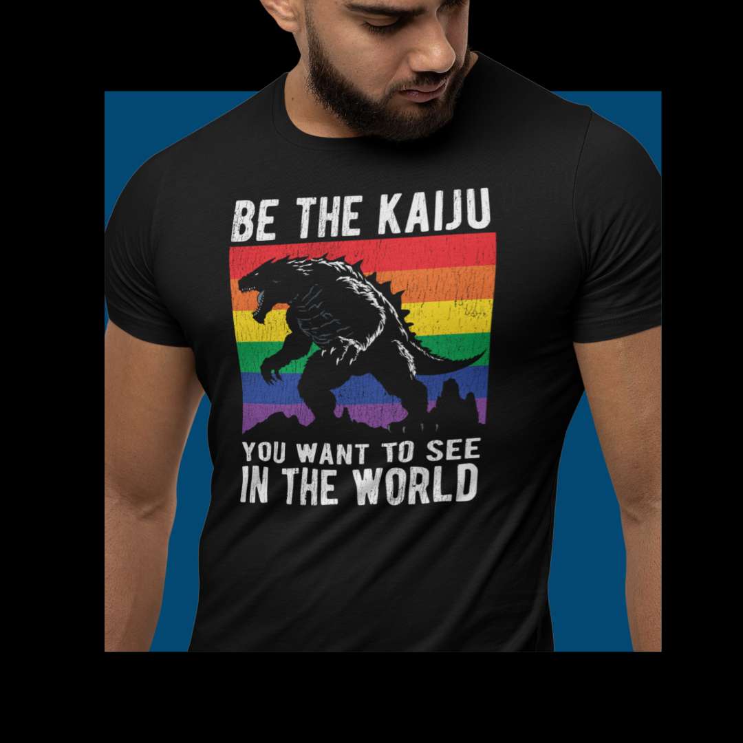
Welcome to the Spring 2026 drop at Hunky Tops! As the solo owner of this queer, Latino-owned store, I am constantly looking for ways to celebrate our individuality and our community. Historically, I've done most of the graphic design for the shop myself or relied on overseas labor, but for 2026, I set a new goal: I wanted to pivot to more human, queer-centered designs. My plan is to collaborate with a different designer from the LGBTQ+ community every single month, making sure that what I offer is made by queer people for queer people.
I am absolutely thrilled to introduce you to my very first commissioned artist for this initiative, the incredibly talented Los Angeles-based brand designer, Jamie Hahn. We connected through a platform called Hey Famm, and right from the start, I knew Jamie was the perfect fit to kick off my spring collection.
The Initial Idea vs. The Pivot
When I first reached out to Jamie in late 2025 to plan this March launch, my creative direction was honestly pretty vague. Because it was for a spring drop, I initially suggested a theme centered around "renewal and rebirth, but of course gay and sexy".
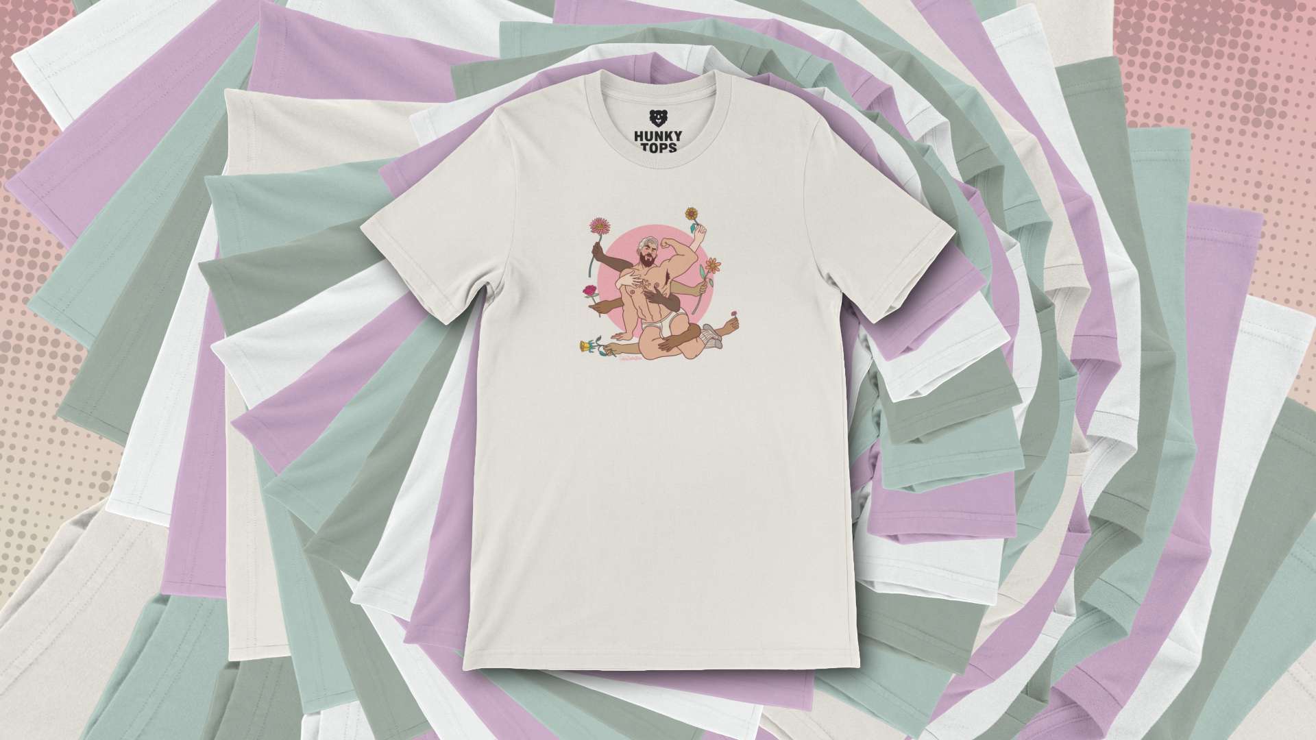
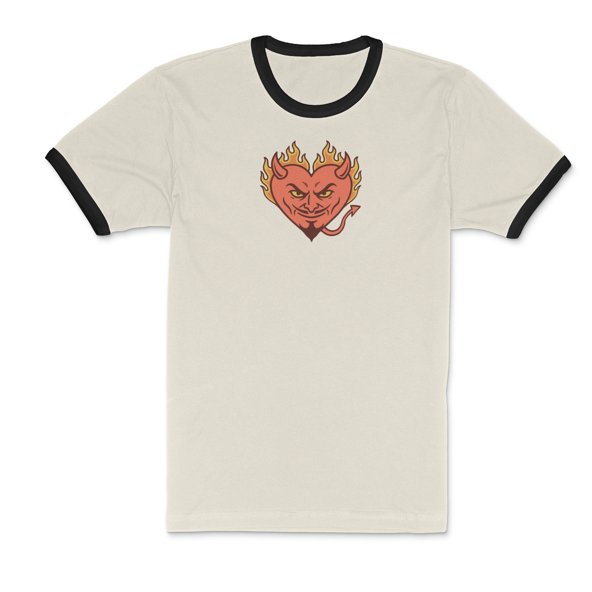
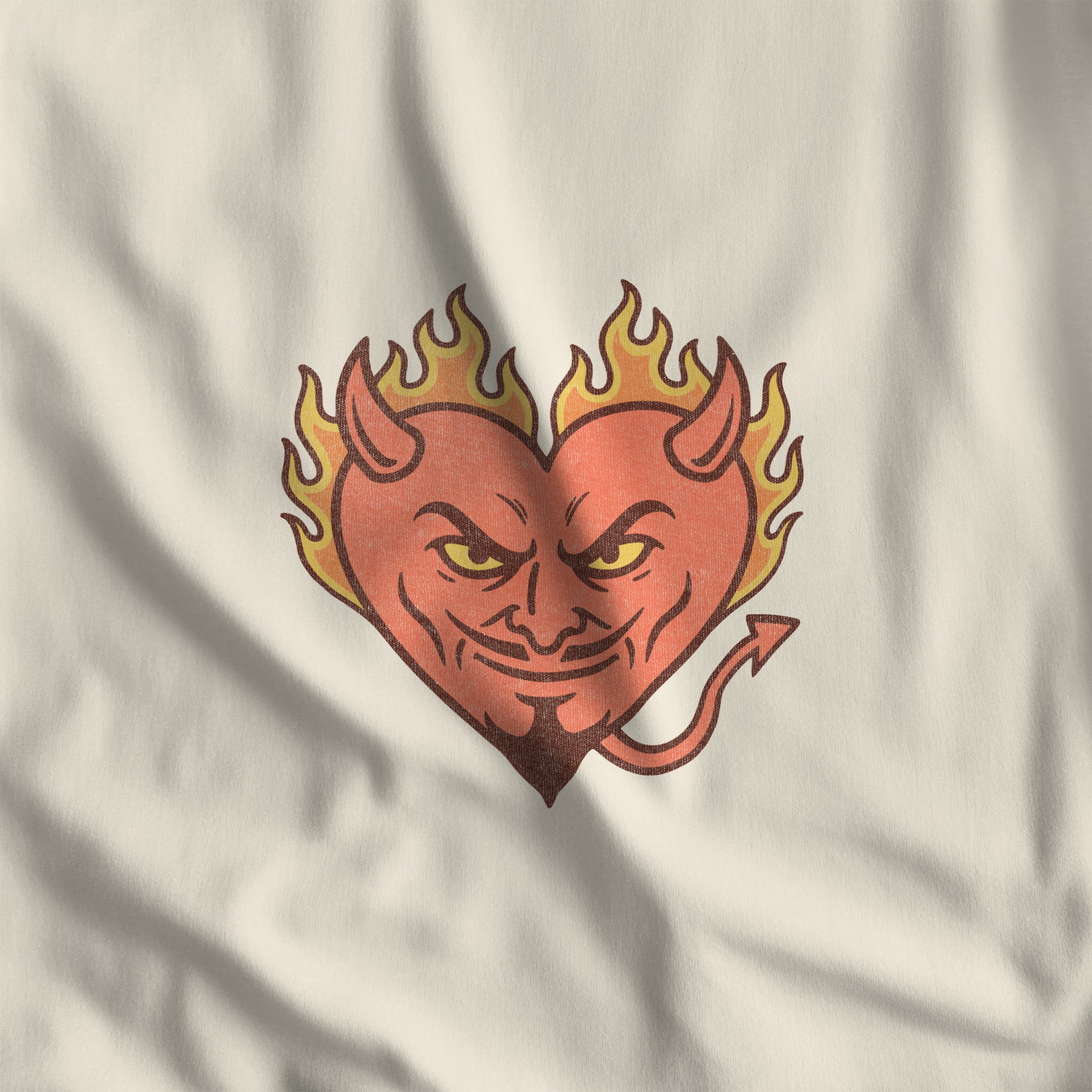
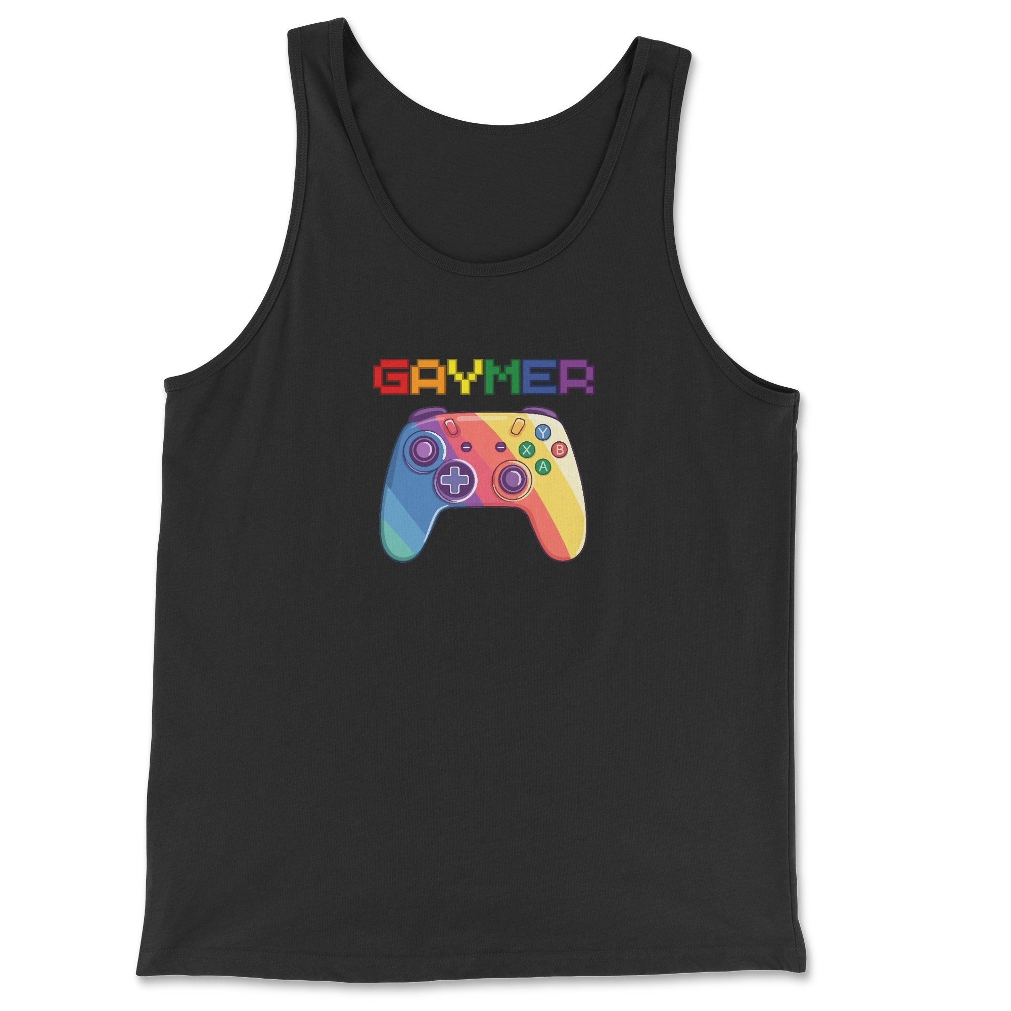
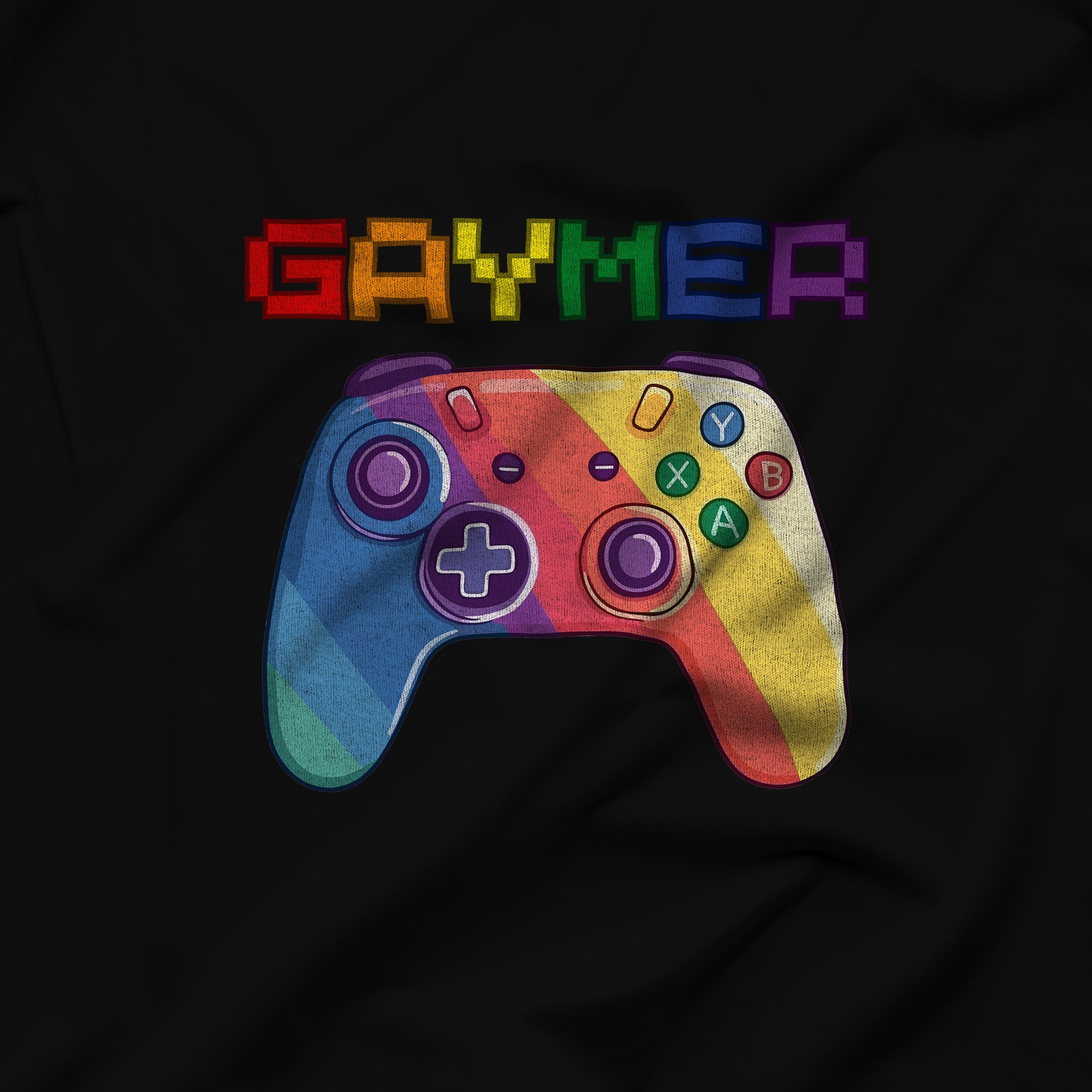
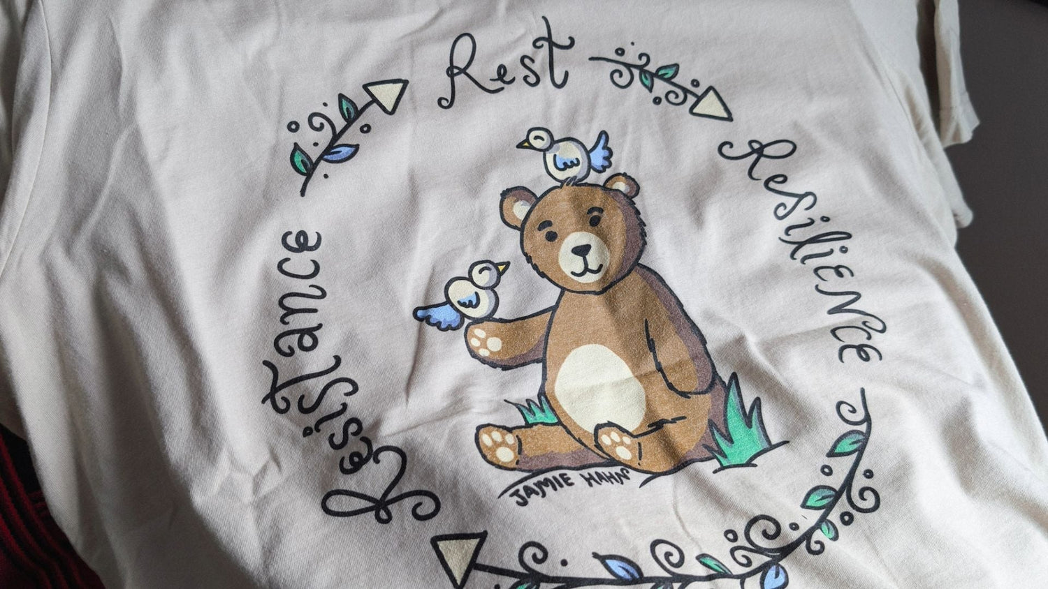
Featured product:
However, as we actually sat down to chat, the reality of the world shifted our focus. As a queer immigrant myself, I couldn't ignore the scary political climate we are currently navigating. I told Jamie that I wanted to pivot to themes like "strength" or "comfort". I wanted a design that made a statement and reflected my brand's values—standing with immigrants and trans folks—without being overly distressing. Jamie came back with a brilliant suggestion: let's create something that leans into the political climate but remains relevant forever.
The Concept: Activism and Self-Care
Jamie took those thoughts and transformed them into something profoundly beautiful. They conceptualized a design centered on community activism, but with a crucial reminder: self-care is a necessary part of that involvement.
As Jamie so perfectly put it in their artist statement: "I was inspired by the process of being involved in community activism/advocacy. So I included the words 'Resistance', 'Rest', and 'Resilience' as a cycle, because you need all three to create a sustainable system for action and change. Take care of yourself and take care of your community! <3".
The Process and Evolution of the Art
The collaborative process was such a joy. Jamie’s first draft featured the words "Resistance," "Rest," and "Resilience" forming a continuous cycle, with a peaceful bear in the center accompanied by some bird friends. Jamie explained that the birds could represent the intersections of our identities, or simply creatures who are very different still living happily in harmony. (I didn't even tell Jamie, but I personally love birds, so it was a perfect coincidence!)
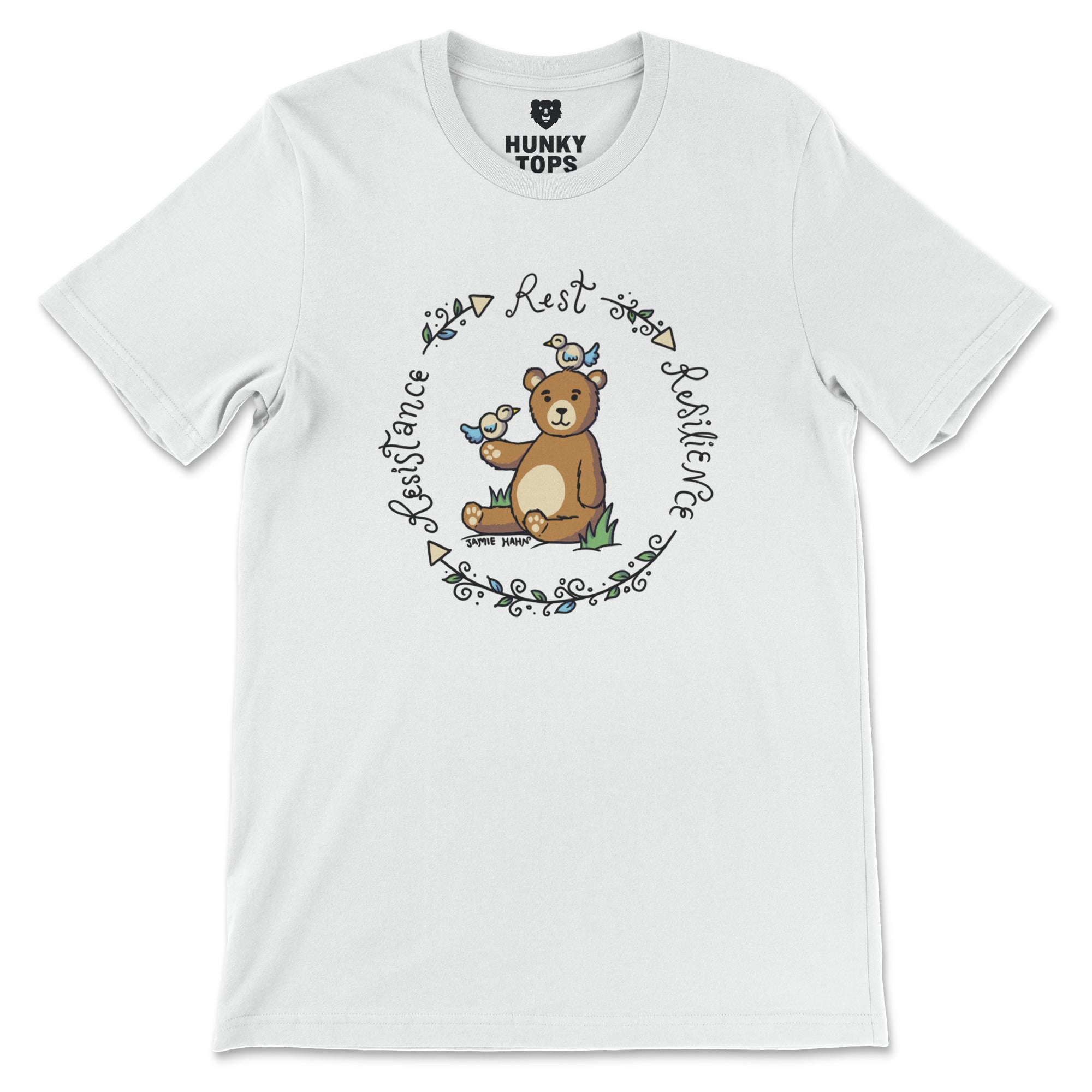
I instantly loved the message and Jamie's signature curly typography, and after a few iterations, we arrived at the perfect design that's available today.
To top it all off, I asked Jamie to sign the final artwork. I want it to be abundantly clear that this is a piece of art created by a talented queer designer, and I'm so pleased they agreed to put their signature right there in the grass.
Wear Your Resistance
Taking a moment to rest can be your greatest act of resistance. This design is a gentle nod to self-care, creativity, and strength, and I am so incredibly proud to share it with you.
The "Rest -> Resilience -> Resistance" design is available now across the shop. You can grab it on a lightweight Bella+Canvas T-shirt or tank top, a cozy Gildan hoodie or sweatshirt, a vintage-style ringer tee, a Comfort Colors long-sleeve tee, or even a heavy-duty canvas tote bag.
Take care of yourself, take care of your community, and let your wardrobe tell your story!